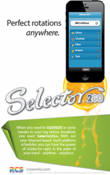
RCS created the world’s most popular professional music scheduling system but we’re not resting on our laurels. We’re forging ahead, innovating, using the latest web technologies to redefine how radio is programmed and operated; where business is being done; and who’s doing it. We’re breaking through barriers to make operating a radio station more efficient and easier now than at any point in the past.
Consider this: you can use your smartphone to update your music library, schedule your station, integrate the traffic log, analyze your schedule, manipulate it, and send the final log to your automation system and you can do it from virtually anywhere in the world regardless of where your station resides. You can do this using the latest RCS technologies!
We have re-imagined our most popular and beloved product, Selector, for the 21st century. But we didn’t start from scratch, we took the best of what it is, it’s essence, and updated it. In re-imagining our product we made it a point to pay homage to what made us number one in the first place. The things people loved about Selector are still here, along with new innovative ways of interacting with the elements that make up professional broadcast software.
 As we designed our modern products we recognized that one size does not fit all. Broadcast professionals are doing business with a variety of devices in the office, and on the go. When we went to the drawing board we decided to tailor a set of products specifically to the office environment, and another for your mobile experience with a shared common set of core functionality in the middle to ensure that while the user interface differs between the two worlds, the information is identical. That’s why we have created essential professional broadcast software that works from the desktop to your tablet to your smartphone. We could have made a one-size-fits-all approach, but it wouldn’t have been nearly as good on either platform. By crafting products tailored to each environment, we have a winning strategy in our business market and one that our users will love.
One of our important design goals in crafting our modern apps was to deliver a common experience across platforms. The technologies we’re using enable us to deliver a common experience whether you’re on an iPad, a Kindle Fire, an Android smartphone, or a Google Nexus tablet. In choosing our underpinning with care, our modern products work similarly on existing platforms, but more importantly, they will work on new devices that enter the market, which is key as the market becomes saturated with more and more devices of differing dimensions and features.
We have designed our mobile applications with thoughtfulness. To make our applications responsive and useful on mobile devices, we engineered them to deliver data in small, quick bursts. We filtered the scope of the information to the most important aspects. We’ve crafted our apps to enable you to go as deep as you need to; the information delivered to your mobile device is in small chunks, but you can easily add more and more information to your list with the press of a virtual button. When lots of items are repeated in your screen we move the controls to the item you’re interacting with instead of creating more and more controls, this keeps the app small and quick. We’ve kept things simple. We’re exposing the most-used and most important functionality of our core product in our mobile applications and kept the less-often-used, more intricate minutia in our desktop application. As I said, we are forging ahead and we hope it’s as exciting for you as it is for us.