Max Davies here to share a couple of examples of very useful albeit long-standing features within the Aquira UI. These are seemingly “little things” that can actually make a HUGE difference for anyone managing their traffic.
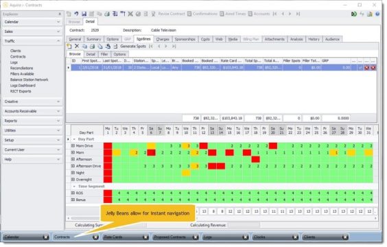
Aquira has the ability to have multiple screens open at the same time with each screen showing as a jelly bean shaped button at the foot of the display. This workflow may seem like a bit of a no-brainer to those of us who are familiar with the 21st century but for a lot of users, this departure from the archaic “close down what you’re doing to go into a different part of the product” workflow is a massive time saver.

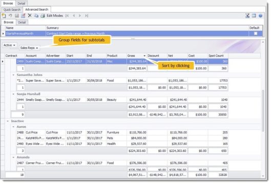
Another useful feature that should get special attention is the fact that some of the browse screens instantly show totals and subtotals for returned results without the need to generate separate traffic reports or opening the individual items. What’s more, you can easily cluster/group these results (by dragging fields into the header area) and see the subtotals dynamically update. You can also choose which data fields to display (and sort them). Again, simple enough and not necessarily a new thing to RCS products, but a very handy time saver that not all traffic software products can do!
